Gray: an introduction
Meet an underrated and budget-friendly workhorse
Hi everyone,
Welcome to the first post of our newsletter!
Today, we’ll share an introduction to the color Gray, which, as you’ll learn, is one of the most multi-use and budget-friendly colors in a designer’s arsenal.
But first, we wanted to share our plans for our upcoming posts and podcast episodes:
We have 2 posts on summer colors (Gray and Ocean Blue) that we will release ASAP - as long as there’s still a hint of summer in the air! These 2 posts are English translations of German blog posts that Anna-Lena has published on her website. You can read the original version of today’s post about the color Gray here, and the original Ocean Blue post here.
Each post will be quickly followed by a podcast episode discussing the color in more detail, followed by 2 more podcast episodes that we’ll release in quick succession, on Sophisticated Sports Fandom and Incorporating International Design Influences. If you were part of our test audience, the episodes will be familiar to you, but we’ve now added intros and outros to make them more digestible for a wider audience.
Once all 4 podcast episodes have been released, we will be looking to take stock of where we are and what our community is interested in. We have lots of ideas, but we will be looking forward hearing from you about what you’ve found interesting, and areas we can focus on going forward.
If you haven’t already subscribed, please do so! That way, you can be sure you get all of the upcoming posts and podcast episodes.
Enough housekeeping! Now sit back, relax, and enjoy Anna-Lena’s introduction to the very underrated and multidimensional color Gray, and learn why she associates it with summer.
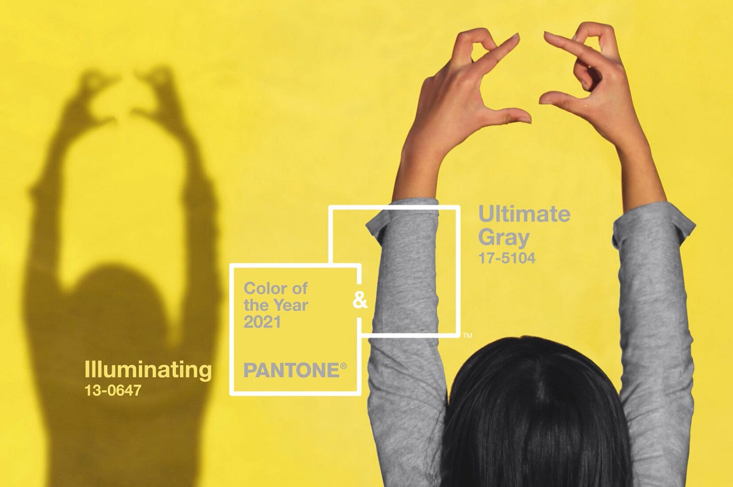
When the color provider Pantone revealed their Color of the Year 2021, it led me to think of summer.
"PANTONE 13-0647 Illuminating, a bright and cheerful yellow, bursts with vibrancy and warms with the power of the sun.
PANTONE 17-5104 Ultimate Gray embodies the solid reliability of an enduring, secure foundation. Like pebbles on the beach that withstand the test of time, the subtly reassuring Ultimate Gray creates a sense of calm, steadiness, and resilience."
Yellow as a summer color is intuitive. But GRAY? How is gray a summer color?
Pantone’s description triggered an immediate association in my head. Reading about the warm yellow sun hitting a fine pebble beach brought me back to the summer of 2019, when David and I did a 10-day van trip in Nova Scotia, New Brunswick, and Prince Edward Island. This was the part of Canada I had most wanted to visit, and I was worried that maybe I had set my expectations too high. I shouldn’t have worried: it was absolutely stunning.
Since the region is surrounded by the Atlantic Ocean, we visited many different beaches, some full of sand, others that were rockier, including one that was strewn with beautiful gray stones glittering in the sun. As the memory resurfaced, I knew I wanted to make gray my next summer color.
But it's not just the pebble beach in Canada that makes me think of Pantone’s gray-yellow summer combination: the interplay of light and shadow also brings back memories that are unique to summer.
Imagine this scene: you're at your favorite beach club, lying in a deck chair under a palm tree, and squinting into the sun, which has just risen a bit higher in the sky. You look at the stone path nearby, and see the light and shadow on the stones playing off each other. The sunlight is yellow. The shadows are gray.
What other, more general, associations do we link to the color gray?
First of all, gray is perceived as one of the most neutral colors, which is why it combines so fantastically well with other colors.
Gray is also perceived as:
wise
balanced
humorless
impartial
elegant
stable
adaptable
boring
reserved
One association I particularly liked, because it triggered both a positive and negative reaction in me, is timelessness.
Anyone familiar with the work of German author Michael Ende will understand why the combination of “time” and “gray” might provoke a negative reaction. In his famous book "Momo," the Men in Gray steal people's time, making life sterile and devoid of meaning.
But gray has many positive qualities.
Because it is timeless, gray is an excellent color for investing in quality pieces that you want to keep over the long term. As your tastes evolve and trends change, you can keep your gray items, mixing and matching them with other pieces in different colors and styles.
Despite its unassuming nature, gray can pull much more weight in a design than most people give it credit for. It can provide a cool or warm contrast. It can play a silent companion to a flashy color, or it can project an elegant self-confidence.
With that said, a gray-heavy design requires both skill and courage to execute. If it’s not done well, a monochromatic design can easily look boring; or conversely, overwhelming.
But monochromatic designs are certainly worth trying, especially in small rooms - in large rooms, too, if you have the budget! Some tips:
Choose a balance of both cool and warm gray tones
Be conscious in the tones you choose - don’t choose them haphazardly
Don’t forget to consider how the room will be lit, as this will also affect the tones’ warmth
Gray suits an eclectic style just as well as a minimalist style. It’s an all-rounder in both decor and fashion.
So now, I'm going to take my gray summer dress out of the closet, pair it with some gold jewelry, and go out for ice cream. Later, I might go to the beach to collect stones or shells. I wish you a cheerful, warm summer with pleasant cool breezes.


